Help Willa Choose Paint Colors

Need advice, technical help or opinions, you will find plenty here! (Technical posts here)
Post Reply
User avatar
Willa
Revered expert in almost everything
Posts: 1369
Joined: Tue Dec 06, 2016 9:46 pm

Help Willa Choose Paint Colors

Post by Willa »

Paint colors is an area where I severely overthink - and am still wrong 1/3 of the time.

Here's the front and side of my house (the other two sides are plain):

_DSC0012.jpeg
_DSC0012.jpeg (719.11 KiB) Viewed 753 times


_DSC0008.JPG
_DSC0008.JPG (837.79 KiB) Viewed 753 times


Front door is currently painted Benjamin Moore HC-141 Hollingsworth Green. Ceiling and door trim are temporarily Wythe Blue HC-143. Ceiling looks perfect in this color - door trim looks too blue for my tastes(no pics of this yet)

_DSC0051.JPG
_DSC0051.JPG (708.19 KiB) Viewed 753 times


Hollingsworth Green:
MPC00005960-2.jpg
MPC00005960-2.jpg (5.81 KiB) Viewed 753 times


Wythe Blue
imgres.jpg
imgres.jpg (1.32 KiB) Viewed 753 times

User avatar
Willa
Revered expert in almost everything
Posts: 1369
Joined: Tue Dec 06, 2016 9:46 pm

Re: Help Willa Choose Paint Colors

Post by Willa »

Conceptual agonies are related to what color should go where. The shingles are sort of a rust ombre to black. The trim next to the shingles is closest to this BM color HC-51 Audubon Russet:

imgres-2.jpg
imgres-2.jpg (885 Bytes) Viewed 752 times


I have been looking at lots of painted lady type victorian house pics. In theory I think that the darkest colors should be at the most recessed details, although painting the decorative board next to the roofline Audubon Russet would make it look weightier, though the details would look best in a lighter contrasting color.

My favourite color combo so far has been (all BM Historical Collection colors to limit my choices):

Benjamin Moore HC- 56 Georgetown Pink Beige:

d6bafd4cec3b8a01457d3c4e67f621cf.jpg
d6bafd4cec3b8a01457d3c4e67f621cf.jpg (5.76 KiB) Viewed 752 times


Broadstreet Beige HC-48

imgres-1.jpg
imgres-1.jpg (758 Bytes) Viewed 752 times


Princeton Gold HC-14

MPC00005958-2.jpg
MPC00005958-2.jpg (6.3 KiB) Viewed 752 times


Richmond Gold HC-41

MPC00102912-2.jpg
MPC00102912-2.jpg (6.37 KiB) Viewed 752 times


New London Burgundy HC- 61

c7d1b6f79c9939817b1380307883680e.jpg
c7d1b6f79c9939817b1380307883680e.jpg (6.84 KiB) Viewed 752 times
Attachments
imgres.jpg
imgres.jpg (885 Bytes) Viewed 752 times

User avatar
Willa
Revered expert in almost everything
Posts: 1369
Joined: Tue Dec 06, 2016 9:46 pm

Re: Help Willa Choose Paint Colors

Post by Willa »

Colors in the main stained glass in the house:

_DSC0003.JPG
_DSC0003.JPG (1.22 MiB) Viewed 751 times

User avatar
Willa
Revered expert in almost everything
Posts: 1369
Joined: Tue Dec 06, 2016 9:46 pm

Re: Help Willa Choose Paint Colors

Post by Willa »

Conceptual conundrums:

- But I also like yellow brick houses with blue/gray/green trim !

- Aluminum storm windows will have to remain until I can afford better wood frame storms or interior storms. These fit well and have screens so while not perfect, if it ain't broke, don't fix it ? Therefore thinking the window trim next to the storm windows should be painted a color that approximates aluminum color to minimize the differences. (Yes storm windows would be taken off to paint and repair windows first)

- Original House paint seems to have been very dark blackish green around windows and on porch details, with an ochre color on the sash windows. Traces of a brighter malachite green paint remain on the 2nd floor side window.

- I tend to choose low contrast colors that are barely distinguishable from one another.

- Also hung up on the idea of painting the soffits sort of an old fashioned peachy pink lingerie color

- I like the idea of all the colors looking somewhat sepia toned together.

- Will strong horizontal lines of color make my house look fat ?

User avatar
Lily left the valley
Inventor of Knob and Tube
Posts: 2170
Joined: Sun Aug 14, 2016 2:07 pm
Location: Gardner, MA, USA
Contact:

Re: Help Willa Choose Paint Colors

Post by Lily left the valley »

Willa wrote:- Aluminum storm windows will have to remain until I can afford better wood frame storms or interior storms. These fit well and have screens so while not perfect, if it ain't broke, don't fix it ? Therefore thinking the window trim next to the storm windows should be painted a color that approximates aluminum color to minimize the differences. (Yes storm windows would be taken off to paint and repair windows first)
I can't remember which blog it was, but there was a couple that painted their aluminum storms to match the wood. They looked great.

As to the fat query...I might have something for you to look at soonish.
--Proud member of the Industrious Cheapskate Club
--Currently pondering ways to encourage thoughtful restovation and discourage mindless renovation.

User avatar
Lily left the valley
Inventor of Knob and Tube
Posts: 2170
Joined: Sun Aug 14, 2016 2:07 pm
Location: Gardner, MA, USA
Contact:

Re: Help Willa Choose Paint Colors

Post by Lily left the valley »

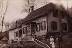
One thing I want to mention, and I'm not sure how good your camera is, Willa, but the front of house image that's from the listing is only 72 dpi (dots per inch--a leftover from print days), which means even when I try to increase that for better quality, it's sort of a hit or mess as to what the pixels will decide with details. If you don't know how to check it, and you have Windows, on an image that's stored on your computer, you can right click it and choose "Properties". Then look for a tab that says "details". If you scroll down a bit, you will see the dpi size. 72 dpi is often typical for average web images, even if the original had better quality because it makes the storage size of the image more ideal, as it is smaller as well.

The downside of that is it made it pretty impossible to do any "color washes" with the fill even in PS--it would fill half or more of the section I was focusing on. This took longer than expected because I had to manually outline bits and just do a straight fill, losing most detail like shadows. It's not nearly as complete as I planned to have ready after I had my late night snack. I think there is a way to use one of the PS tools that will grasp what the fill zone should be better, but the ones I'm used to and tried fared poorly. I just had the thought that I might be able to do a color replace with the lasso tool that would retain the details better.

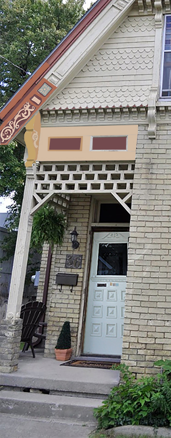
I tried to follow your mentions as to what you were seeing where, but you may have a very different image in your head, and I may also have misunderstood some things you wrote. I'm not clear at all on the brick color (if any) from what you wrote, which could just be from my sleepy brain at the moment. My brain keeps blocking paint choices on the brick, saying "It's brick! No need for paint."

I did cut and paste your already painted door from your posting so that would be right, but did not paint the porch ceiling. I also did not do the door trim, nor the porch pillar and upper lattice. I wasn't sure if the trim was still the same color in the same photo I took the door from, or if you had since painted over that, so that's one reason I just left it the listing image color.

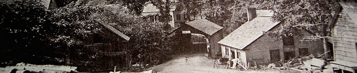
For reference, I took most porch terminology save trellis (no beaded rail) from the image below, but what I'm calling the beam might be the fascia, now that I'm looking at it again.
Image

The color of the barge board detail scroll and the beveled rectangle are the same color (Georgetown Pink). The barge board itself is the Russet, and the recess the Burgundy.

The front of the post face bracket is Princeton Gold and the side is Richmond Gold. The scroll is Broadstreet Beige. I just realized after I posted this and looked at the other images again that are close ups of the post face brackets that the scroll I was seeing in close up was not a details, it seems to be an actual cut out and thus would not be painted. Drat.

The beam is Broadstreet Beige. I only did the inward bevels on the left rectangle of the beam inset, because I was thinking maybe I should do two variants (time again). I wasn't sure if you'd have preferred the Burgundy was the recess color which would mirror the barge board (I used Richmond Gold), and chosen a lighter for the face of that detail instead of the recess, or if you would like the contrast as I did it. If you like the "blue" behind the burst, that might be another place to feature it as a tie-in overall (mentioned below) if you don't want to cool down the beam using the blue there.

I did put the door color on the back of the sunburst detail of the barge board, but realize now I used a shadowed area to pull from, so it actually looks a bit closer to your Haint chip even though it is not. I also used the Russet color you said was closest to the color just under the roof in a section of that exact spot so you could get an idea of how off the colors are from your chips and the image. I also used the recess color for that strip in between to give it some texture so you have the weight you wanted, yet tried to give it a waistline, in a sense, to keep it from looking fat since you were concerned about that. You may prefer a lighter color, and I was going to do that further up so you could see the difference, but time wasn't on my side.

The low quality of the image made it very tricky without additional close ups to guess the designs on the barge board, so they're approximate. I did use your recess color behind the fish scale at its lowest point, then realized what time it was before I was about to start painting up in that area. I was planning to use it as a detail "waist" where the mini corbels are as well as the Russet to carry the barge board triangle frame.

I'm sorry I didn't get further with this, but I hope it helps a bit. Here's what I have so far, just based on the palette you posted and how I read your notes:
Image
--Proud member of the Industrious Cheapskate Club
--Currently pondering ways to encourage thoughtful restovation and discourage mindless renovation.

User avatar
Mick_VT
Moderator
Moderator
Posts: 2437
Joined: Sat Aug 15, 2015 2:39 am
Location: Central Vermont
Contact:

Re: Help Willa Choose Paint Colors

Post by Mick_VT »

Don't be frightened to go dark, a mix of browns, deep reds and hunter green would look stunning against that brickwork, with perhaps a little cream (or that Hollingsworth) for details
Mick...

User avatar
Willa
Revered expert in almost everything
Posts: 1369
Joined: Tue Dec 06, 2016 9:46 pm

Re: Help Willa Choose Paint Colors

Post by Willa »

Lily left the valley wrote: If you don't know how to check it, and you have Windows, on an image that's stored on your computer, you can right click it and choose "Properties".


I am on an old, old Mac, so much of what you are telling me goes right over my head.

My computer claims the house images I posted are 872KB and 393KB Jpegs. I don't know if some image compression happens when pics are posted in the forum or --- ??? ----

If you PM me with your email address I can email you the pics that way, which might mean you get files you can work with, if you want to have some house coloring laughs ? I am not technologically saavy at all.

User avatar
Willa
Revered expert in almost everything
Posts: 1369
Joined: Tue Dec 06, 2016 9:46 pm

Re: Help Willa Choose Paint Colors

Post by Willa »

Mick_VT wrote:Don't be frightened to go dark, a mix of browns, deep reds and hunter green would look stunning against that brickwork, with perhaps a little cream (or that Hollingsworth) for details


I just hate brown paint. Don't ask me why - I hate it !

I've also had experience with darker grey paints acting in irregular ways and being very difficult to match perfectly, even when using the same formula so I am leery of that.

I have been leaning towards at least one accent that is more purple, which will play off against the yellow. I want to use a lighter paint on anything that has a surface with incised lines, so as not to obscure that detail.

I forget where I read it (Old House Guy ?), but there was the theory that the lower story or foundation should be darker that the upper stories, as to paint the upper story darker leads to a heavy look. This would mean that I would be bound to mostly light pastel shades but I don't want the house to look cutesy wedding cake.

If the roof wasn't rusty colored, I would be free-er to choose colors as I feel this is an aspect of the overall look of the house that can't be ignored. Same with the color of the bricks being non-negotiable. Therefore russet and a light mustard/gold must be workable within the overall look with other colors .

I also feel that the colors need to be muted or greyed down a little as the brick is multiple subtle variations of that yellow, none of which are pure or bright. The BM Historical Collection paints are perfect in this regard.

I think it is acceptable to paint the different types of decorative shingles different colors, but feel these shouldn't be a strong contrast to the brick.

So many surfaces to fret about...

User avatar
Manalto
Inventor of Knob and Tube
Posts: 2111
Joined: Tue May 16, 2017 11:09 pm

Re: Help Willa Choose Paint Colors

Post by Manalto »

Willa, are you in Canada? Assuming you are at a northern latitude, you have the luxury of using darker colors. They make quite a strong statement, so I understand your trepidation. The benefits outweigh the risks though, and if you get it right, then it's "wow." Have you tried asking at paint stores? Sometimes you'll get someone who really knows his/her stuff and makes good suggestions - which you may not necessarily follow, but will stimulate thinking down another path.

I feel the way about blue as you do about brown, for both cars and houses.

Your house is beautiful. What rich detailing it has!

Post Reply