Here are some similar local houses on Realtor.ca with painted trim, and different approaches:
- 4ca733d2bb23a0a4fc30f2ffc43d598a.jpg (106.64 KiB) Viewed 2565 times
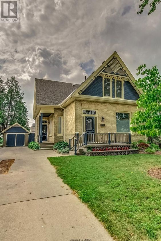
The dark navy-teal works well with the yellow brick , but to my eye I think it would look better with the painted areas reversed - ie dark trim around the windows and doors, and the verge/barge board being dark.
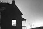
- fd8dd4b99113126c6065b261d953d543.jpg (71.87 KiB) Viewed 2565 times
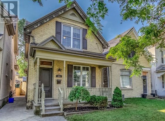
Oh, those awful fake shutters that are everywhere. The dark trim should have also been used on the first story, especially for the (too skinny) posts that support the porch. Being painted the light, almost brick color makes them look weak. Throw out those shutters and paint dark around the windows, too.
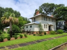
- 4cb76e34cef8039138e3e1c375382cf7.jpg (62.29 KiB) Viewed 2565 times
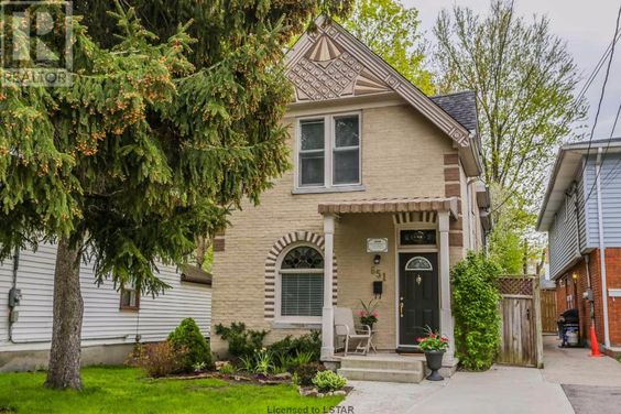
The taupe and buff paint look really blah next to the yellow brick, and those potch posts need to be dark. Even if they added a third medium color like olive, it would liven this up. I am really not liking the window trim being almost brick color.
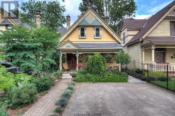
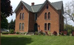
- e9d19f3f7bcd2406a34e4a425566f808.jpg (62.19 KiB) Viewed 2565 times
This house looks so much more lively than its taupe and brown neighbour to the right. It's hard to judge the colors as realtors typically fiddle with them somewhat. I think the trim around the windows would look better in a darker color, and there needs to be more teal on the main floor porch as a horizontal, like by the many spindles or the board that runs across to pull it together more. The decorative shingle color looks too orange to me ? I see at least 4 colors in this low res pic, so they get an A for trying.
Seeing these have helped me to better understand what I think visually works and what doesn't on a house this style. What do other people see/think ?