Page 1 of 2
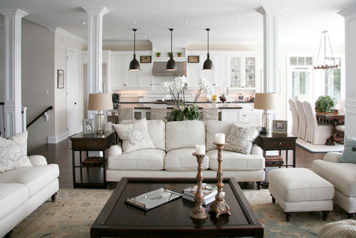
What's wrong with this picture?
Posted: Tue Jun 19, 2018 11:25 am
by Manalto
I couldn't figure out how to post the picture directly, so here's the link:
https://www.houzz.com/photo/1328503-lak ... om-torontoHere you go:
 (added by Mick_VT)
Re: What's wrong with this picture?
Posted: Tue Jun 19, 2018 12:34 pm
by 1918ColonialRevival
Well, to start off with, the kitchen is in the living room!

Re: What's wrong with this picture?
Posted: Tue Jun 19, 2018 1:13 pm
by Manalto
LOL - I agree! Anything else? How do you like the color scheme?
Re: What's wrong with this picture?
Posted: Tue Jun 19, 2018 1:41 pm
by MJ1987
Manalto wrote:LOL - I agree! Anything else? How do you like the color scheme?
Well, let's just say I wouldn't want to walk through that space after a hard days work outside and bump into anything.... I have a feeling I'd leave evidence on just about every surface with which I'd come in contact.
Re: What's wrong with this picture?
Posted: Tue Jun 19, 2018 2:38 pm
by Lily left the valley
I know builders started embracing open concept partly because it was much cheaper for them build, but there are folks that prefer what is considered "prospect" in the design world. Some like the notion of being able to see more at a glance for various reasons. "Refuge" is the opposite end of the spectrum, more along the lines of traditional older homes. You can have refuge spots within a larger prospect space, like aediculas (sp?) and inglenooks. I learned about these concepts in the
House Thinking book.
I'm with Matt, though. I'd be terrified of touching anything after doing some work in the garden.
I'm also not a fan of the white on white movement. Especially not for non sleek moderne homes.
Overall, every time I see shots of homes like that, my brain just goes...

It's just not a style I like at all, so it's cringeworthy that it's so promoted as an ideal.
Oh...and having looked at a few other pictures...if you're going to waste so much money trying to look like you have money, you couldn't put the TV up in a way where it can be easily hidden? Lazy and cheap.

Re: What's wrong with this picture?
Posted: Tue Jun 19, 2018 9:32 pm
by mjt
We had a friend in the neighborhood who had an all white interior. It was an old house and fortunately had NOT been converted to an open floor plan, but every room was a different shade of white. It was very disorienting an made all the interesting architectural features of the house disappear.
Re: What's wrong with this picture?
Posted: Thu Jun 21, 2018 7:10 pm
by awomanwithahammer
I don't like totally open concept, but I do like sight lines. I don't like having to go through multiple doors to get to where I can see something. I did open my house up some, but not completely. I got a severe case of claustrophobia in an area where there were 4 doors in one small radius (radius isn't the right word, but you get what I mean).
That said, I could not live in this house. In my home kitchen, we have a wide opening between it and the dining room, approximately 6 feet wide. Do you know that you can't get a baby gate that wide? We didn't even think about it, but now we have a 16-month-old grandson whom we can't keep out of the kitchen. I had to content myself with removing all chemicals and cleaners from lower cabinets and putting child-proof locks on the doors. Can you imagine trying to baby-proof that house?
Re: What's wrong with this picture?
Posted: Fri Jun 22, 2018 12:36 pm
by Jeepnstein
I like color. And a bit of chaos. A house like that would demand constant cleaning and primping. Far too high maintenance. Also, I didn't see a cat in any of the pictures.
Re: What's wrong with this picture?
Posted: Fri Jun 22, 2018 2:35 pm
by Manalto
Jeepnstein wrote: Also, I didn't see a cat in any of the pictures.
Right! Or a big, slobbering boxer. All the HGTV-type, rubber-stamp renovations I see cause me to imagine a 'For Sale' sign out front. The goal is to be as neutral as possible so no one will be offended by anything when you put the house on the market. Willa put it perfectly - prisoners of their own real estate.
This room is the work of Catherine Staples Interiors, who claim, without the slightest hint of irony:
"A tailor made service that caters to the specific needs of the project resulting in a unique interior that exceeds the expectations of the client."
And why pay $700 for a pair of candlesticks when you can just steal them from the cathedral down the street?

Re: What's wrong with this picture?
Posted: Fri Jun 29, 2018 7:24 pm
by phil
Its designed for peace and tranquility , because your friends wont' want to visit


 It's just not a style I like at all, so it's cringeworthy that it's so promoted as an ideal.